
Project 1: Zine


In this project we did something called a Zine, like the word magazine but the ending letters. We were tasked with the challenge of creating images combing 50/50 with pictures and text. For me I chose the topic of time and how it's constantly moving. I have laid them out so they start from the top left corner, to the bottom right. The first one I created is a watch made out of text saying "time is fleeting", I also used a ubre effect and shading of the color blue along with the texture along the outside using ink and gauze. This one is my favorite. The ones that I would do over again are the one saying "Time is a gift that most people waste, I would redo the hatching because I didn't put a lot of emphasis on it. There is a lot of unity between all the images but they are all balanced with the amount of value or color and form. I love the variety of things I used be they all come together for one united rhythm and contrast.
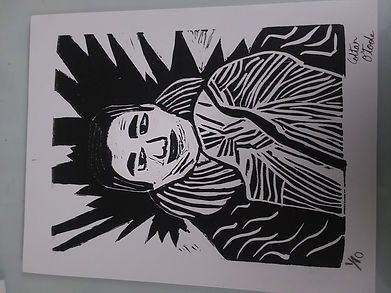
Project 2: Linocut Self portrait
In this project we had to do a couple things. We had to find a picture of ourselves and print it in black and white. Then we had to decide what was gonna be black and white when we traced it onto our block and carved it out. For tracing we had to run a pencil along the back to get a layer of graphite. Next we had to place it on top of the rubber block and trace out the black part with a pencil so the graphite transfers on top of the block. The image I chose had a nice balance of black and white even tho there is a lot of positive and negative space. I tried to get a variety of patterns, this is because I couldn't get a large value of colors outside black and white. Nor could I get shades for this project, but I could technically get some with the Ghost print. I was happy overall with the results of the prints, I wish I would have chosen a harder picture to carve but next time I do this I wil challenge myself a bit more.


Project 3: Geo filter

In this project we were given the task to create what's called a Geo-Filter. Which is basically a place, name, holiday, etc and a bunch of images that go with the text. For me I created one for The OBX which is shorthand for The Outer Banks, NC.I surrounded it with pictures of a stained glass, compass rose, puffer fish, wave, message in a bottle, shell, drink, beach ball, and umbrella. I used the smooth tool to smooth out the lettering from my original drawing. The color swatches I chose were bright but I made different shades and variants. I would have drawn better images but I still like the layout and how it came out.
Project 4: Dry Point Etching


In this project we were supposed to find an image that was up close and with a lot of texture. I chose my boyfriends shirt and boutonniere from this years homecoming. I chose this because I love the image and I could really run with it. I first traced the image outline onto a piece of paper then I tapped that to the back of the acrylic sheet we were given. Then I etched the image into the sheet and I used a lot of cross hatching to get darker shades which is hard and makes an annoying sound. I am pleased with the results on this project
Project 5: Animal Illistartion

For this project we were tasked with finding a animal image and then creating it into an illustration. I chose a sloth for mine. We were originally supposed to have it be our pets but all I have are cats that are dark and that would be hard to even get a picture of. So I went with my favorite animal. This project we fun but I would have liked to have done it on Photoshop instead of Adobe Illustrator because Adobe illustrator doesn't like me. The turn out for this project was ok but I could have done better and taken my time.
Project 6: T-shirt design


This project I loved because I can make my own T-shirt design. I chose something unique. It is a quote "When words fail, music speaks." I love this quote because music is dear to me. For this project we had to create our own design and then cut it out on basically a sticker. Then we had to stick it onto a stretched piece of mesh then ink up a shirt. I loved doing this and am pleased with the turn out.
Project 7: Poster


For this project I tried to create a poster that was fun and upbeat. I drew out my images of a beach ball and the text first then I took a photo of them and uploaded them to Adobe Illustrator. Then I positioned them where I thought they would look best. I tried to create a shadow with song lyrics but I couldn't get it too look how I wanted it to. If I had some more time and used Photoshop I would have been able to do better I think.